UI/UX DEsign

LinkedIn – Optimizing resume tailoring

Creating a premium subscription-driving feature that streamlines resume tailoring
Role
As the project champion and sole UX and UI Designer I was responsible for User Research, Wireframing & Prototyping.
Timeline
July 2022 (revised December 2022)
overview
I designed a new feature within LinkedIn that creates a seamless resume tailoring experience to increase the efficiency of resume tailoring and ultimately drive more premium subscriptions. Tailoring your resume is a commonly suggested way to increase the visibility of an application within ATS software. The current process for tailoring resumes requires users to analyze the job descriptions themselves or use various niche services which results in a disjointed and frustrating experience. This gives Linkedin an advantage in the market as they have the opportunity to create an uninterrupted tailoring experience.
The challenge + Business Opportunity
Job hunting is a job within itself and can last months. With varying strategies and opinions it can feel super isolating, like you're putting in a ton of effort for seemingly nothing. I was inspired to create something that could make this process a little easier and so I began looking into the most popular job board around, LinkedIn.

LinkedIn is a professional social networking platform that connects individuals and organizations for networking, job searching, and career development. Linkedin generates its revenue through job listings, ad space for businesses and premium subscriptions. Premium subscriptions allow users unlock additional features and tools to help them in their job search. I think if there was a way to optimize tailoring resumes to match job descriptions within LinkedIn then this feature could provide more value to premium subscriptions, giving users an even bigger edge in their job search.
Solution
Short on time? No problem!
Skip to the final designs
The Users

The target users for this feature are individuals on LinkedIn who want to tailor their resumes to match job descriptions.

User pain points

To understand my target users, I used a combination of a literature review (5 published papers, 25 job seekers and recruiter blog posts) and user interviews (with 7 recent college graduates who relied on LinkedIn for job hunting) to identify relevant pain points:

Pain point 1
Tailoring resumes is time-consuming
Interviewees tailored resumes based on job descriptions to increase visibility, but expressed dissatisfaction with the time and effort required for each application.
Pain point 2
Finding a matching job takes time
Interviewees use LinkedIn for job search but face difficulties due to varying skill expectations and exclusions (e.g. no visa sponsorship, education requirement, etc.).
Pain point 3
There is uncertainty with strategies
Job hunting strategies are very personal, and often conflicting. A person's strategy for finding a job changes often due to different opinions.
Cognitive WALKThrough

Since LinkedIn already has a way to create resumes within the platform I felt this would be a good jumping off point for the new feature.

Rationale
I conducted a cognitive walkthrough, a usability evaluation method that delves into a user's thought processes when using a product, so I could identify potential hurdles, such as task completion difficulties and comprehension issues.
Goals
  • Identify any specific usability issues or areas of improvement within the task flow.
  • Suggest design improvements based on my findings.
Cognitive Walthrough insight 1
The resume builder is hard to find
The entry point for the resume builder is easy to miss with all of the other features LinkedIn has. If users don't know there is a resume builder they can't use it.
Cognitive Walthrough insight 2
The suggested skills are not relevant
Once in the builder LinkedIn suggests keywords to add the your resume, unfortunately they are generic and don't add much value.
Cognitive Walthrough insight 3
Editing in the resume builder takes more time
The flow within the builder requires the user to click on a edit icon to bring up an editing pop-up. This makes the process of editing a resume take much longer.
Cognitive Walthrough insight 4
The final resume is not acceptable
After the user finishes editing their resume, they have the option to export it as a PDF. However, the resulting PDF's layout doesn't make good use of space and doesn't meet current resume standards.
Define
Brainstorming + scope

After several brainstorming sessions I evaluated potential features on the following three categories: How many user pain points does this address, how much value does this feature bring to the resume tailoring process and how simple is the feature to build. Tallying up the scores, I defined the scope for the MVP:

  • Update the current dashboard to include relevant keywords directly from  job descriptions
  • Introduce a more intuitive entry point within the current premium section
  • Improve resume builder functionality for greater efficiency
  • Add template options
wireframe 1

With a clearer understanding of the issues, I set to work on generating new ideas with an emphasis on increasing the efficiency of the resume builder and introducing relevant job description information into the task flow.

The biggest issue with the resume builder as it stands was how many extra clicks it takes to edit a section. With this in mind, I explored alternate ways for users to edit their resume. Primarily I explored allowing users to edit the components within the resume builder workspace.

While I reduced the number of clicks required to edit a resume by removing editing pop-ups. However, taking a step back, I felt it appeared too complex, with numerous form components associated with each section. This complexity could lead to errors and make it challenging for users to navigate.

wireframe 2

To simplify the wireframes, I re-evaluated my understanding of how users will use keywords, leading me to a key realization: the user spends time carefully choosing the appropriate keyword and where it fits in their resume. This process allows for some added friction in the flow, as the time a user spends clicking into each section is not wasted, but rather spent considering their options.

This principle allowed me to simplify the editing sections because our user doesn’t know which word they want to replace with what yet. I reverted to the original flow, including the pop-up editing sections, to reduce visual clutter and help users focus on the task at hand. Additionally, it's easier to build, aligning with our business constraints.

One more thing to consider

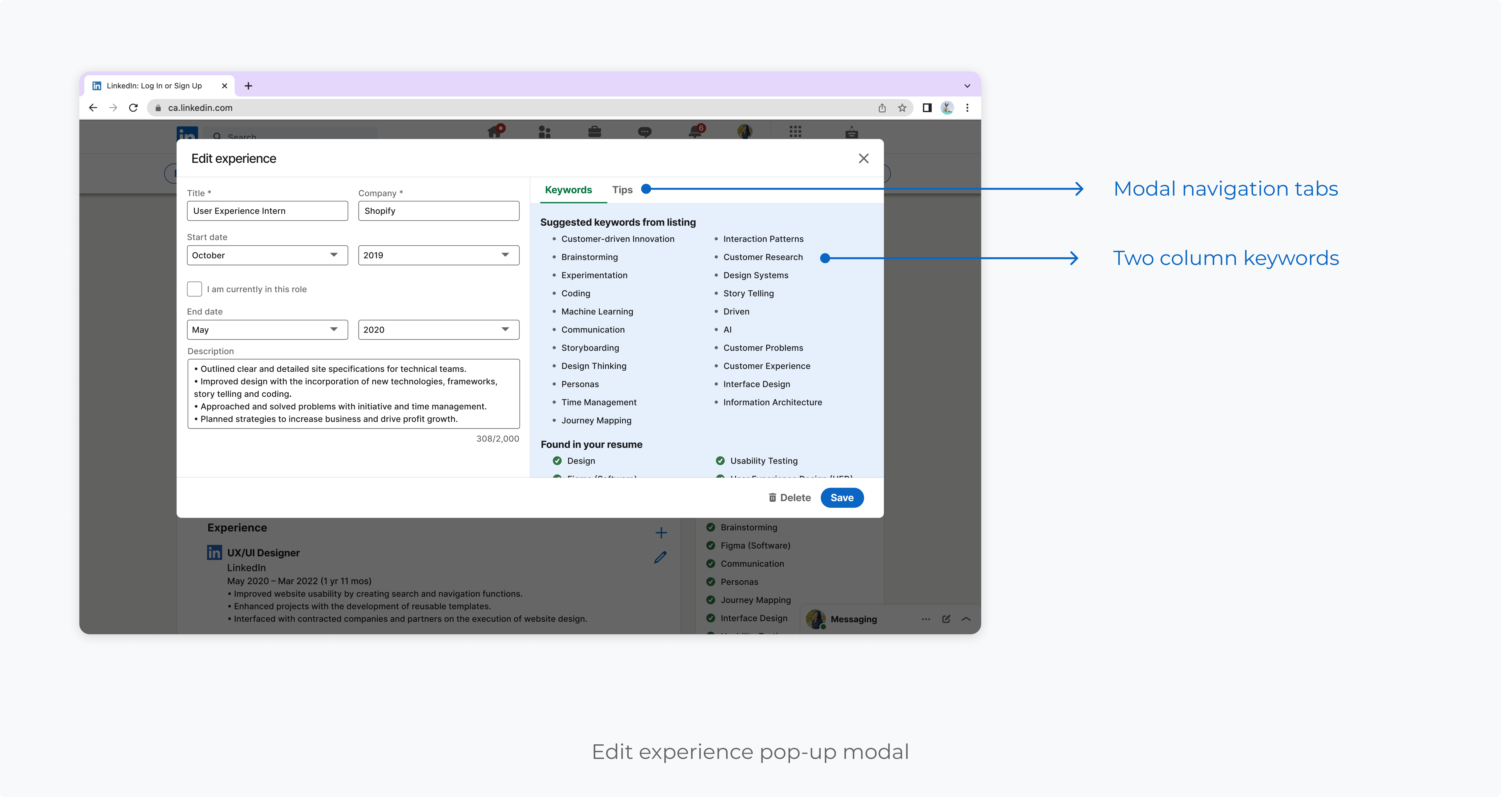
Should the users be provided with more context about the origin of keywords? Do they consider the frequency of a word in the job description significant? While initially, I believed that providing more information would be beneficial, I encountered implementation and accessibility challenges with data tables when communicating frequency. I explored the following options when considering adding frequency alongside the keywords in the resume builder and edit modals.

Option a
Better use of space
Easier to build
Preserves triple click (can highlight entire keyword with triple click for easy copy pasting)
Doesn’t give users context (no frequency)
Adds additional navigation within edit modal
Option b
Clearly indicates frequency
Preserves triple click
Doesn’t make good use of space (The section becomes really long due to padding)
More difficult to build
The ‘found in your resume section’ is pushed really far down because of the size of the table.
Option c
Better use of space
Found section is closer
Frequency isn’t clearly communicated to users
Doesn’t preserve triple click
Adds additional navigation within edit modal

Final designs
ENtry POINt

By including the entry point within the job posting an intuitive user flow and simplified logic for populating the resume builder with relevant job description keywords was achieved. I used a premium section similar to the existing premium applicant information for consistency. To minimize visual clutter and encourage user engagement, I kept the information to a minimum.

Edit skills section

Editing skills is an easy way for users to incorporate relevant keywords because it requires no context. Unlike other areas, users wouldn't need to think much about it. Input chips were created to enable users to quickly browse and choose appropriate keywords.

Template selection

Users need the template preview images to be large enough to show the layout of the template. I applied LinkedIn's button hovering and selection logic to the templates. The main focus when designing the template modal was to make the layout of the templates visible.

measuring success
Future steps

If I could build out this solution for LinkedIn users, I would measure its success by looking at a few key indicators:

User experience success
Task completion rate
Are users who are exposed to this new experience creating resumes using the resume builder? How efficient is it?
User experience success
User retention rate
How often do users use this feature post launch? Are users applying at higher rates?
Business success
Premium subscriptions
Does this feature help acquire new subscribers and retain current ones, as subscriptions are LinkedIn's primary source of revenue.